
Programs Used: Tableau, SQL, Docker
Project Summary: Visualizations were used in a presentation to give insights to fellow students on how users utilize the Bixi bike rentals service.
Pipeline:
- Loaded Bixi trip information into SQL using a docker container.
- Linked Tableau program to SQL database.
- Created Visualizations to easily communicate core insights regarding Bixi bike trips (samples featured below):
Average Trip Duration of Users: 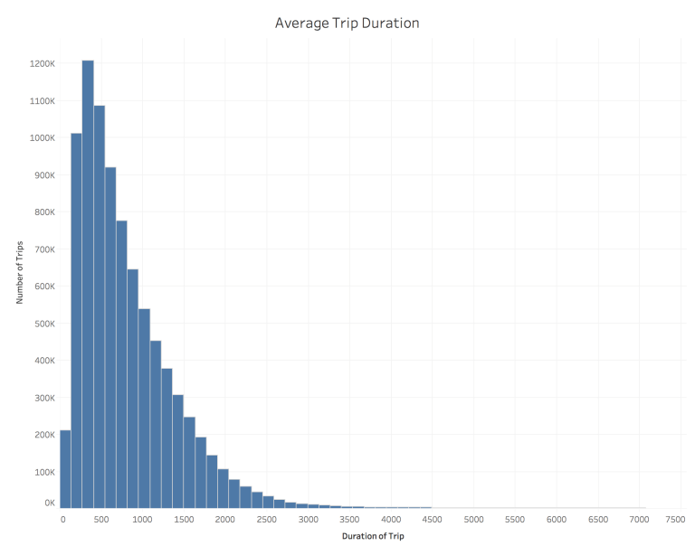
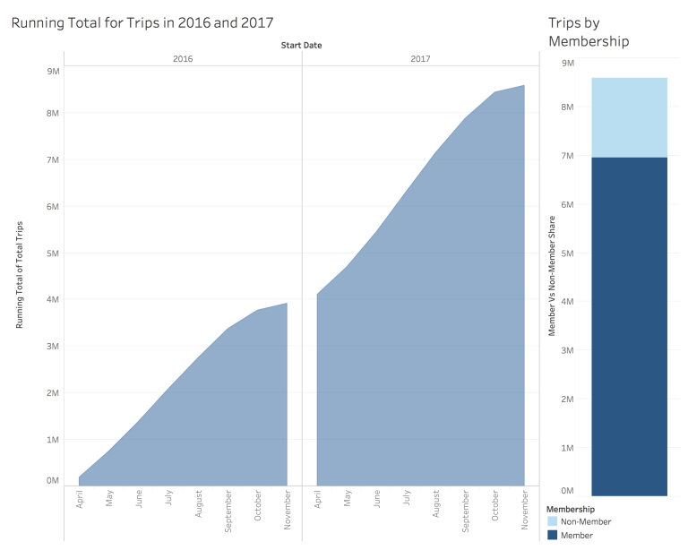
Running Month by Month Totals and User/Non-User Breakdown:
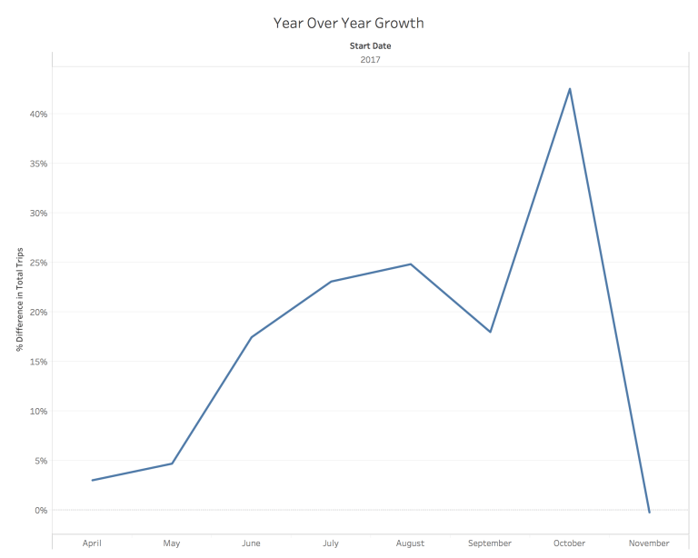
Year Over Year Growth for 2016 and 2017:
4. Presented Project to fellow students and answered all questions regarding insights and the data set
